Wednesday, March 30, 2011

The Pheromoans - Midnight Watchdog Ep

let's do a really quick post tonight before i have to go draw some shit and go to bed.... this Pheromoans ep caught my attention a while back but i never got around to posting it for some reason... but when i posted the Vaccuum EP last week and was talking about the cool little cut away detail on the back cover was it reminded me that i needed to post this record on here as well.

very nice illustrated composition on the front panel with some nice and sloppy hand written type. it's interesting that nothing on this cover seems to be centered or even straight on the page. this lack of concern for formalities is rather refreshing, and while i am sure it was intentional, it still comes off effortless somehow. well done...


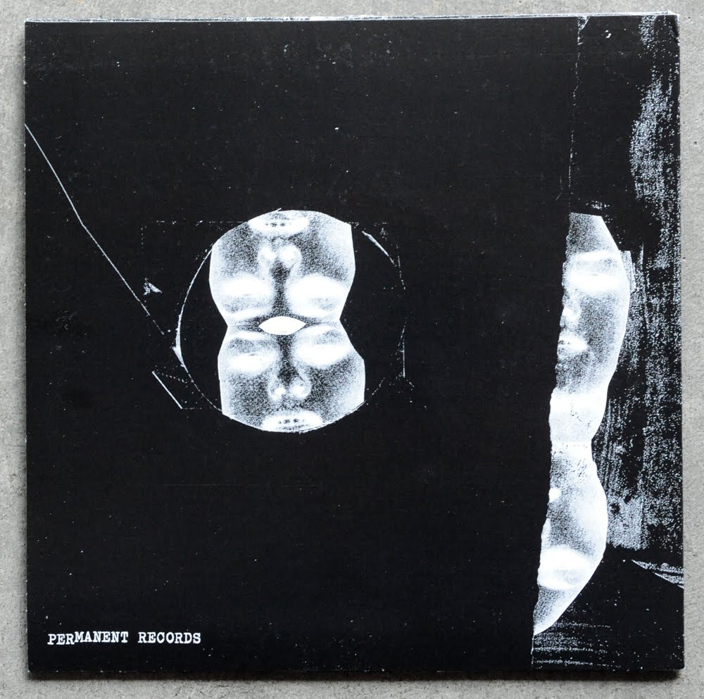
lots more to look at on the back.... there is that cut away i was talking about in the previous post i made last week, does anyone know who is manufacturing these covers? it's offset printed on watercolor paper and then die-cut and glued, and it's easily my new favorite type of 7" record sleeve. i just love feeling the tooth from the paper when you pick this thing up, very cool. back cover has more of that sloppy inked out hand writing for the song titles and then even less of that same style of illustration from the front....


A and B labels are a standard issue from the record label, but they look decent...


sadly, no insert, but i bet it would have been a hand written masterpiece! pick this up from Sweet Rot Records directly....

Thursday, March 24, 2011

Vaccuum Ep...

love this new Vaccuum Ep on Lengua Armada Records.... great abstract collage based art that was cut and pasted together with some ransom note typography to go along with it. it's the perfect punk formula for making record cover art that was done here with just the right amount of personal style. there are a lot of nice little details built within all the art for this record....


more photo based abstract art on the back panel.. these jackets were spot color offset printed on what feels like a watercolor paper and then were die-cut and glued. i love the little cut-away on the top of the back cover and also the rounded corners, very classy!


this insert is so rad... this is a 6.25" x 11" folded piece of vellum, printed on one side to be a lyric sheet. love the way all the type was spaced out around the photo, and it looks as though the whole thing was typeset with letraset! leaving the scribbles in was a solid move too... awesome job!


blank A and B labels and no paper sleeve, kinda like the minimalist approach...


Wednesday, March 23, 2011

Tear It Up Poster....


i recently designed and screen printed this poster for my old hardcore band Tear It Up. we are getting back together to play 2 shows this week on the east coast in support of 6 Feet Under Records re-releasing our "Nothing To Nothing" lp.

this is a 3 color screen print on 80lb 18" x 24" black linen paper and can be purchased HERE. to see more of my work, click here...

Thursday, March 17, 2011

Too Fast To Live, Too Young To Die.


i finally got over to Subliminal Projects today to check out an awesome group show called "Too Fast To Live, Too Young To Die". it featured work by just about every name you can think of that was associated with crafting the look, style, and attitude of the early days of the DIY punk and hardcore scene in southern California. while much of the show consisted of work you have most likely already seen reproduced somewhere else before, the experience of viewing these classic images in person was unparalleled to any book or magazine and well worth the trip.


while there was an overwhelming amount of great work decorating the gallery walls, the pieces i was most excited to see and was ultimately most impressed with were the new collaboration works done by Shepard Fairey and Raymond Pettibon. i personally love the style of both these artists so it was rad getting to see them come together on this project. the work was largely Raymond's signature watercolor and illustration that was then collage and spray paint detailed by Shepard...


speaking of Shepard Fairey, his recent portrait of Henry Rollins was up for viewing as well. i love the way he layers into these large scale collages that he has been producing over the last few years, this thing looked sooo sweet in person...


Winston Smith brought a collection of some of his original flyer collages and Dead Kennedy's related artwork to show. i always enjoy seeing his work in person...


half the exhibit was photo work, and just about everyone brought their best Black Flag images. here is what Glen E. Friedman brought to the table...


Jenny Lens had a few photographs on display as well, this might be my new all-time favorite from her body of work...


there was also a great selection of Edward Colver photographs, which was my favorite part of the photography selection. these three of Edward's stood out to me...


lastly, there was an LA centered flyer installation by "Fucked Up & Photocopied" author Bryan Ray Turcotte. there was a good mix of your classic favorites as well as the more obscure flyers, here is a small sampling of what was on display....


this show will be up for another week or so, be sure to check it out if you live in the LA area...

SUBLIMINAL PROJECTS GALLERY
1331 W Sunset Blvd
Los Angeles, CA 90026

Tuesday, March 15, 2011

Gentleman Jesse & His Men Ep

i thought this was a pretty cool concept for cover art on this new Gentlemen Jesse & His Men Ep. it's basically just a recreation of a Georgia drivers license, only it's been abstracted by the fold of the cover and in the process creates a nice random and kind of sparse layout. take a look at the front cover, i love that the photo lands just off center on the panel and you get that nice hint of type coming off the spine. man, that photo makes my face hurt...


the back panel is where all the type lives. all of the text has been altered to contain the necessary information in the same typeface and ordering style of the actual license. this panel is slightly off center as well thanks to the fold....


here is a shot of the whole cover unfolded...


A and B labels are standard issue for Hozac, but the yellow paper mixed with solid red vinyl actually looks pretty sweet...


for more info on this release, check out the Hozac Records site.

Sunday, March 13, 2011

Bitchin Bajas / Moon Duo Split EP

i'll be honest with you, i have no idea who these bands are, i haven't listened to either side of this record and most likely won't, and i'm ok with that. i picked this up recently at Amoeba 100% because i loved the collage art on the jacket. in my past experiences with this form of art based record buying, i am usually quite disappointed with the records on a musical level, so i'm just not even going to go there...

so yeah, check out this collage work, this thing has got it all going on.... those broken up lines look insane with all this black and white saturation happening, and i love the way they handled the type too. when you have such a heavy art piece going on i'm always a fan of small and out of the way type...


ohhh and this back cover is killer too! look at that single hairline of white running into the center image from the side... without that line this thing would be shit, but it perfectly breaks up that huge sea of black and then also balances the whole composition. epic....


i wish i knew who to credit for this record art, but unfortunately there is no insert.... which is a shame considering how awesome the jacket is, i would bet that the insert would have been pretty great as well.

A & B labels are a bore, but the printed black paper sleeve was a nice touch...


here is what the Permanent Records website had up for info about their release:

We here at Permanent Records couldn't be more delighted to be sharing with you our very first Record Store Day exclusive release, a split 7" between (the brand new CAVE side project) Bitchin Bajas and Moon Duo (featuring Wooden Shjips' guitarist Erik 'Ripley' Johnson). CAVE and Wooden Shjips share a lot in common, but their respective side projects make an even better split pairing. Each band specializes in minimalist, repetitive psych that's obviously influenced by krautrock. However, they differ in that Bitchin Bajas focuses on melodic repetition while Moon Duo is heavier on the rhythm and quite a bit darker. This is Bitchin Bajas' debut release. Moon Duo has released three critically acclaimed records to date. Both tracks on this split are exclusive to this release, which is limited to 750 copies, never to be pressed again.

Thursday, March 10, 2011

NY Rules Compilation

i got a nice little package in the mail from an old east coast friend last week... Max from Burn Books sent over the this very slick NY RULES cassette compilation he just released, check out this envelope it was sent in...


yeah, this cassette came in a 9" x 14" screen printed envelope! that's nuts.... here is a shot of the front of the cassette, aesthetically this kinda looks like a budget 80's tape you might have received free with purchase in your order from BMG or something.... pretty funny. file under: so bad it's good.


the back panel text ordering could have been a bit cleaner, but it does the job... i do love the A and B indicator symbols.


the actual tape itself is a yellow professionally manufactured and printed cassette, and this thing looks sweet! i'm liking the font mixing between the bold, the outlines, and the fine inside the A and B indicators... it all comes together beautifully right here.


the single panel layout inside the front cover is dedicated to the band credits.... fully justified type was a good choice, but it could use a bit more space between the edge of the type and the outer key line that holds it all in...


oh yeah, did i mention that this thing comes with a huge poster too!?! this 22" x 30" poster was offset printed on newsprint and is sure to piss off your mom when she sees it hanging on your bedroom door.


max and his Burn Books partner Alex put this whole thing together, including all that fancy horror make-up. they are solid dudes worthy of your support, so pick up your copy of this release here. it's currently in its' second press of 250 copies and will not be repressed...

Thursday, March 3, 2011

Deep Sleep - "Turn Me Off" Lp

it is with great pleasure that i bring you a new blog post on a top notch release, the brand new Deep Sleep Lp! i've loved every record these guys have put out (musically as well as visually) and i'm elated to finally get a review up on this site...

if you've been keeping up with this blog over the past 2 years, it most likely will come as no surprise to hear me say that i love a band with both a strong and consistent aesthetic, and Deep Sleep continues to dominate in category as far as current bands go. each record layout is tigthtly conceptually crafted by their singer Tony, who has a remarkable knack for transforming 1950's film stills into compelling punk imagery. while all their cover art has been great, the use of repeated and split imagery on this cover really elevates it to a new level while also revealing an evolution of process...


these covers were professionally offset printed and glued on a nice coated cover stock paper. back cover is pretty straight forward, a simple live shot collage of the four members and then the song titles neatly arranged down the center. clean and easy....


the insert to this record is a 12" x 24" fold out poster which was also professionally printed on a coated paper. the main art side is a continuation of the front cover idea, pulling more vibe from 50's film idols for all you nostalgia buffs, but more importantly it the continued use of repetition. pretty nice looking poster if you ask me...


flip this bad boy over for the lyric sheet, and watch out cause tony is a master when it comes to utilizing a letraset type sheet. those crisp helvetica song names looks so good with the typewritten lyrics too, i'd actually have a hard time deciding which side of this insert to hang on the wall....


black and red labels on white vinyl is pretty juicy. side A gets all the info across...


side B label is where the eye-candy lives, nice little cut and paste job over here...

you can pick this up from the Grave Mistake site...