Monday, May 30, 2011

New Art Print Available...


i finished printing another art print this past week.... this one is an 18" x 24" screen printed poster on 100lb cover stock paper, 5 colors in total, titled "Never Enough" . the main illustration was one of the sketches i made for my daily drawing blog Focus On The Negative.

to see more of my screen printed poster art, click here. to purchase this print, click here.

Wednesday, May 25, 2011

Teargas - The Way Of All Flesh LP

another great release i picked up recently from australian label Hardcore Victim... Teargas kicked off their US tour last week here in Los Angeles and they were great, so don't sleep on seeing them if they are rolling thru your area!

really nice illustrative art on this release by Murdoch. he has a very clean and bold graphic quality to his art, and i like the way he varies his ling weights to create dimension within his pieces. he draws with just enough detail to keep his pieces interesting without letting them become meticulous or heavy...


the back panel has a continued art theme carried over from the front, and the hand inked song titles add nice balance to the panel. these are folded and glued sleeves on coated matte cover stock...


inside the jacket there is a 11" x 11" double sided insert, also which was professionally printed. on the one side you have ambiance....


flip the insert over for the lyric sheet... not the most interesting to look at, but serves the readability needs well....


more illustration on the A and B labels... can't quite put my finger on what the A label is reminding me of! i hate that!....


Tuesday, May 24, 2011

Kromosom Demo

a friend of mine brought this Kromosom Demo back for me from his trip to Australia... these covers are black and white photocopies, love the hand written bold type cover art!


the tapes were professionally manufactured and printed with silver ink. once again, that type looks sharp...


the inner panel of the insert is pretty insane... this whole composition is comprised of hand drawn lines and type! the angle of the lines and the variation between positive and negative space gives the art a lot of really nice movement...


hit up the guys over at Hardcore Victim to get a copy....

Friday, May 20, 2011

Obits - Moody, Standard, and Poor Lp

when i heard that NYC based Obits would be releasing their second lp this year, i was almost as excited to see what it was going to look like as i was to actually hear it! front man Rick Froberg loaned his art skills once again to grace the cover of what will surely be another classic lp to add to his already impressive catalog of hits.

this record is a bit of an aesthetic departure from his usual layered illustrative style, but still remains an excellent exercise in graphic design. throughout the layout, there are subtle details added in to create the effect of a misprinted or out of registration print job. on the front cover image, the art slides down slightly on an angle from left to right while the type remains straight on, and there is a magenta shadow built into the art to create the illusion of a printing error...


i absolutely love the way Rick works with mixing his typefaces, and this back cover panel has got it going on! the altering between the italic and the condensed font styles makes for a pretty dynamic read, and look at that line of copy type running up the left side of the sleeve! that copy holds the whole composition together. the magenta being nudged out of registration looks really killer here as well....


instead of an insert, they went for a printed inner sleeve, which is always a nice touch. the simple, bold, black and white panel is a nice break from the loud colors of the outer jacket. liner notes rarely look this good....


lyrics would have been cool, but i guess they would have been pretty small.... it's kinda interesting that the inner sleeve was printed on a coated gloss paper and then outer jacket was printed on matte stock, it's kind of the opposite of what you would expect...


pretty sure these A and B labels are the Sub Pop standard issue, can someone confirm in the comment section?


Tuesday, May 17, 2011

Slavescene ep

this one's not new but i really liked the art so i'm getting it up on here anyway... excellent use of illustration by Slavescene for their ep on Deranged Records. these cover illustrations have just the right amount of detail to give them character and make them interesting without becoming too serious or losing their naivety. i also really like the effect created by laying the line art over some random halftones and how it brings a little extra color depth into the art...


the covers are most likely photocopies on an 80lb cover sheet, folded not glued... feels right for the art and vibe presented here. the back cover is literally the same panel as the front with just the illustration and song title swapped out, not that it's a bad thing in this case...


there is a folded 8.5" x 11" photocopy insert as well, which provides a small amount of info but mostly just imagery. i could take or leave the collage but all that type next to it is spot on! love the mix of hand-made and typeset fonts going on here...


back side of the insert has 2 goofy / offensive illustrations, but just like the other side, the type is my favorite thing going on here...


bright fucking red vinyl, fuck yeah! i dig the monochromatic color choice for these A and B labels, and also the way the blue pops next to the red, but this whole "fucked up for the sake of being fucked up" image vibe is waaaaay played out for me. i can't help but roll my eyes whenever i see stuff like this (thanks, tumblr!)....


Tuesday, May 10, 2011

No Static 12"

Bay Area's No Statik pulled together a nice looking release for their 12" on Prank Records... the cover illustration and layout was created by Moses Saarni, and i particularly like the approach he used on this cover art. it looks as though he painted out sections of his piece with correction fluid to create highlights, and then also went back in with black ink over top of the white.... it's definitely a finished piece, but it still has a really nice raw textural quality to it when you go in for a close look.


these cut and glued sleeves were offset printed on a matte paper stock. the back cover displays the song titles hand written out running down the center in a column. graphically speaking, there isn't a whole lot of visual trickery going on here, just some type and some dots really... but like the front cover, it retains just enough evidence of the human hand to keep it visually pleasing....


the insert is a 11.5" x 11.5" doubled sided sheet of 100lb cover stock. on the front side it's all about the abstract art, it actually kinda looks like it's making a subtle nod to the back cover of
"Damaged"?...


flip it over for the lyric sheet.... very clean, straight forward, and easy to read. also, very cool live photo courtesy of Martin Sorrondeguy, so that rules...


these A and B labels are ruling it! the A side has all the hand written out song titles, nice and bold white on black looks soooo good. this type has just the right amount of imperfection...


B side is more of those handmade dots from the cover and then the one song title for the B side (dude, 6 song A side + 1 song B side = amazing idea)...


nice work guys...

Tuesday, May 3, 2011

Brain F≠ Ep

a while back i had posted up the Brain F≠ ep on Grave Mistake, this ep on Static Shock came out right around the same time and definitely seems to be following a similar aesthetic...

the front cover image is another found archive photo... the heavy grain in the image almost makes it look like it could be a picture of a TV screen. the type at the bottom is rather unassuming, but not terrible. when you compare the two records cover to cover, the Grave Mistake ep definitely wins out in my book, but this one is still pretty cool on its own. what it's lacking in design flare is made up for in "dark image" ambiguity...


the covers were printed and glued on a matte paper stock, and since Static Shock is a British label, the inner record sleeve is on that nice thicker paper! i have always loved that detail on European releases...

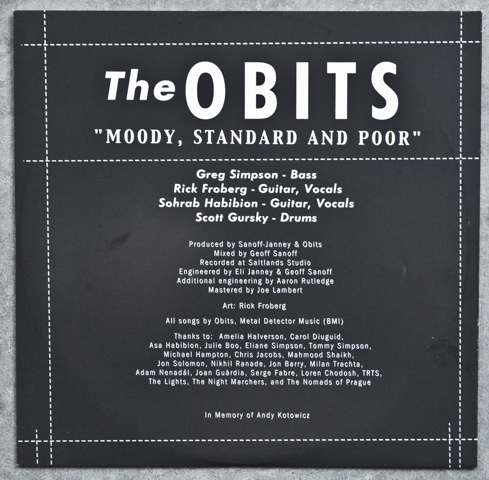
the back cover has more of that excellent typography work like their other release. despite all those different fonts being used at once, this somehow still comes off looking very controlled and clean. it completely defies design logic, and once again, i am impressed. that upside down crown / not equal sign is pretty epic as well. just having that one symbol thrown in the mix looks so killer...


the A and B labels are all over the font chart as well, and these too are pretty sick. 0.75 revolutions per second, huh?...


there are a few Asian characters thrown in here and there that really add dimension to the type, but i really love the big one on the top of the B side label with the F siting next to it! great juxtaposition...


Sunday, May 1, 2011

New Art Print Series..

i recently finished screen printing a new series of art prints that are now up for sale in my store. these are 4 individual 7" x 7" five color screen prints that were made in a limited edition of only 25 prints....


to see more of my art, click here.