Tuesday, June 28, 2011

Wormeaters - Wardeath ep

another cool submission that came in from the great state of new jersey, the Wormeaters ep on Sorry State Records. these bad boys come with 2 color screen printed covers! their bass player Jeff did the layout, i'm not quite sure who did the printing, but the quality is pretty good.


the back panel feels a little thrown together... the type could have been a little more thoughtfully arranged, and there a bit of a weird negative space thing happening with all that white from the shot of the building in the background...


7" x 7" single sided photocopy punk insert, all cut and paste over here.... looks cool to me! and for the record, i choose death all the fucking time....


A side label is carrying all the information. all the type is consistent and easy to read, so that's a good thing....


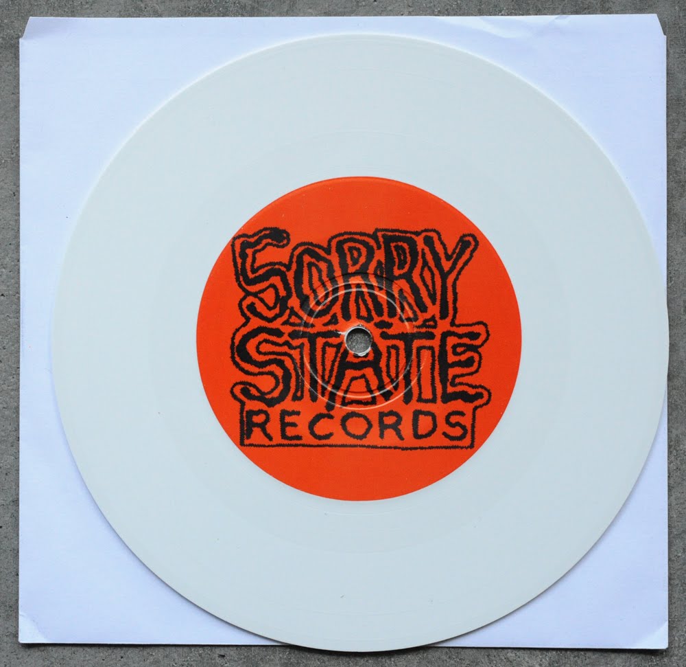
B side is standard issue.... i have been thinking lately that it might be time for a new Sorry State logo, what do you think?


i think Sorry State still has some copies available....

Monday, June 27, 2011

Bloodtype ep...

got a cool 7" submission from NJ's Bloodtype. the front cover illustration was done by Scott Bentz, he did a pretty spot on job nailing the classic straight edge aesthetic. it almost looks like if Zorlac-era Pushead drew the dude from the Uniform Choice logo with his fist punching thru some piece of shit pot smokers' skull... that's actually pretty cool! shit, i'd rock a varsity jacket with that X'ed up fist on it...


the back panel is all type, hand written and really bold. the big painted X sells it for me....


these covers were 4 color offset printed and folded, not glued. there is also a 1 color full panel insert printed on the inside when you unfold the sleeve. as far as lyric sheets go, this one reads well, but feels a little stiff on the design side.


the A and B labels are excellent, might even be my favorite part of this layout! the A side has a nice graphic lock up with the song titles framed in a half circle of X's. very clean, very classy...


the B side is a rad illustration by Jay Jacoby of a typewriter where all the keys are X's. it's a little conceptually "cutesy", but done well enough for me to not really care about that...


there you have it, pretty cool record. you can pick this up from Cowabunga Records

Tuesday, June 21, 2011

Sauna Youth - Lists ep

Rich from Sauna Youth sent over another great 7" for review... similar to their first ep, this layout was drawn by Rich and his brother R.M. Phoenix. the covers were printed using a Risograph machine, which is kinda like a screen print / photocopy hybrid that uses instant automated plating for printing by color. i really love this cover art and that understated type hanging out in the corner. the intentional off-register cyan and magenta colors brings nice movement to the image and makes it way more dynamic than it would have been in just black ink. this thing would make for a killer t-shirt graphic...


these covers were printed on a raw / uncoated card stock and then cut down to be folded. the back panel features some of R.M.'s personal art with a beautiful geometric hand drawn line composition. the type on the back panel is also hand set with letraset to match the front....


the cover unfolds to be the lyric sheet. i love that you can see all the relief lines from where they cut the typewriter paper up and photocopied everything together. this thing looks awesome....


A and B labels are a match back to the insert and are identical. i don't know if the type was intentionally imbalanced on the label, but i love it!


Rich mentioned in his letter that there were 9 different covers made by various artists to coincide with a screen printed poster exhibition, i would have loved to check that out! maybe next time....

Focus On The Negative Art Zine #2

i recently finished making the second Focus On The Negative art zine.... for those not aware, Focus On The Negative is a daily drawing blog i maintain as a place to post up some of the dumb shit i draw throughout the day. i've been posting drawings there for nearly a year now, so i had quite a lot of content to sift thru for the pages of this new zine!

this is a 50 page digital xerox printed zine on light grey paper that's been finished off with a transparent vellum cover. i made a limited run of 50 books, you can purchase one for yourself HERE if interested....


Wednesday, June 15, 2011

Lieutenant 12"

check out this rad submission from Buffalo hardcore band Lieutenant.... limited to just 300 copies, all 300 records come with a hand made cover comprised of splattered silver spray paint and watercolor and then finished off with a 2 color acrylic screen print over top. that's a whole lotta work to put in on 300 records, but it was clearly time well spent, as the finished product looks great! the art is a simple cut and paste composite piece, not sure what the Mona Lisa looking portrait is about, but this screen print is top quality so fuck it....


back cover is just the song titles and label info, not a whole lot to talk about over here....


there is a 2 sided 11" x 11" black and white photocopied insert included. the lyrics are clean and easy to read, and i really like the way they playfully approached their use of positive and negative space with photography. check out the next 2 photos....


A and B labels tie into the insert art and look good. how about that bubble gum pink vinyl!?!?!


included with my package was a rad hand made poster! it's an 11" x 17" one color screen print on 80lb yellow cover stock, and was treated with the same spray paint / watercolor splatter as the 12" jacket. not sure if these actually come with the record, but it really rounded out the whole package in my opinion....


you can get your copy from Art Of The Underground /Peter Walkee Records...

Saturday, June 11, 2011

Cola Freaks - Lp

got my hands on a Cola Freaks Lp from Hjernespind Records last month, and it was worth the agonizing wait.... i love this band, and they can do no wrong in my book. with a string of very strong (both musically and visually) 7" singles spread out over the last couple of years, it's no surprise to me that they were able to pull off such a powerful LP effort. Nathan Kemmerer illustrated a wildly surrealist pen and ink image for their cover art, and while this might not be my personal favorite style of art, the quality of the art is undeniable. he has really nice line work and stippling in the fine details of this piece, my only real complaint is that i wish he had worked the "Cola Freaks" type into the illustration in a more integrated way instead of just slapping it over the art....

these covers are full color offset printed on a thin cover stock and gloss coated. the back cover
took a very minimal feel with just a simple hand done type design. it's not a lot to look at, but the single-line hand drawn box outline surrounding the type was a classy way to make this panel feel like more of a composition than just a bunch of type....


there is also a single sided 11" x 11" printed black insert with a band photo and some more liner note information that didn't make it to the back cover. i'm sure many designers would have tried to resolve the minimal back panel and insert into one layout, but i for one am really glad that they decided to leave them separate and let the information breathe....


A and B labels are the same, utilizing the hand made type from the front and back cover... rather straightforward.....


great release! there is also an american version that came out last month on Douchemaster Records, check it out!

Monday, June 6, 2011

Nightgaun - Absurdity of Meaning ep...

got a cool submission from an arizona band called NIGHTGAUN.... the cover art is credited to Mykil Zep, who made a cool and humorous black and white illustration that fits well with the "Absurdity of Meaning" theme. the type gets a little lost in the line work of the illustration, but i'm pretty sure those were added in after the fact by someone else. that said, i can't help but feel as though this cover would have been so much stronger if he had worked up a nice bold typeface for this cover as well...


the back cover panel and insert art is credited to their guitar player "SBG", he has a much looser illustration style which is kind of charming its own way. it actually kind of reminds me of what every 7th grader's notebook cover looks like after they get into punk. the scratchy hand written song titles really send this thing home...


these covers are professionally offset printed on a coated paper and folded, not glued. unfold the cover for the printed insert inside. man, writing out all these lyrics must have taken some time, but it was totally worth it, cause these two panels look awesome....


check out this grayish-blue marble vinyl! that's pretty rad.... the A and B labels are total type drivers which always feels like a bit of a throw away to me, but at lease they are consistent to the rest of the writing in the insert...


this is a Primitive Future Records release, if anyone has contact info please post it in the comments section....

Wednesday, June 1, 2011

Omegas - Blasts of Lunacy Lp...

nice modern design work on this new Omegas Lp.... it's refreshing to see such clean and methodical cover art from such a brutal hardcore outfit. the central image is simply a gradient color circle, prominently displayed large and bold, with the typography remaining small a and understated to anchor it down in the four corners of the cover. very classy, very well done....


these covers were offset printed on an uncoated matte cover stock and professionally assembled. the back cover is a mirrored image of the front cover with the addition of the track listing added in. this was a risky move, cause it all comes down to the strength of the front cover.... it kind of toes the line between "design brilliance" and "just plain lazy", and lucky for them it works really well in this case....


there is also an 11" x 11" 2 sided printed insert, on the front side is the essential hardcore photo collage, gotta love it....


on the back side there is a lyric sheet and then some more photos? this starts to look a little jumbled to me, maybe just leaving it as a lyric sheet with some larger type would have been the better choice....


my copy came on clear vinyl, which is a personal favorite of mine. A side label was a nice and easy tie-in to the front cover....


B side label ties into the lyric sheet. great photo....


overall, a top notch release, go to the Parts Unknown website for info on where to get yours...