Monday, October 31, 2011

Young Offenders / Airfix Kits Posters...


bay-area bad-asses Young Offenders and Airfix Kits are flying out to NYC this week to play 2 great shows, and they asked me to design and screen print the tour posters! these are 18" x 24" screen prints, 3 colors on 100lb cover stock out of an edition of 60. be sure to go see them on the east!

to see more of my screen printed poster work, go HERE.

Wednesday, October 26, 2011

B-Lines Lp...

it's a bold statement, i know this, but i am going to say it anyway: this is my favorite layout that i have seen in all of 2011. BOOM! B-lines from vancouver used the work of local collage artist Melanie Coles to put together a perfect looking record. every single panel of this layout could stand alone as its own xerox collage masterpiece, yet they are still able to come together and create a body of images that maintain a cohesive look. on the front cover, a really strong black and white photocopy collage that hits you with a nice pop of red. i love the way she mixes hand drawn elements in with the photographs...


these are offset printed and glued covers on a standard coated cover stock. flip the jacket over and you get that red pop from the front smacking you in the face! great use of texture and negative space on this panel, and that hand done lettering looks insane....


there is a 12 page lyric book included with this record. these are 5.5 x 8.5 black and white photocopied books. seriously, well fucking done. every page is spot on, not a thing i would want to see change. take a look at these pics, each page was photographed and posted up...


the A and B labels are very simple but also kinda nice. they established an order to the information and just let it be. it's a very respectable label....


this was a split release between Nominal and Deranged.

Thursday, October 20, 2011

Whatever Brains Lp....

i ordered this Whatever Brains Lp a while back from Sorry State and have been slacking on getting it up here since the layout is so involved (what can i say, even i have my lazy moments...). anyway, Thomas Dean came up with some really cool abstract illustrative art for the front and back cover concept of this Lp. it has a bit of a "doodle" feel to it, but it also has a lot of intricacy and a little too much of its' own rhythm to it for me to actually think that. i like the variation in the line work, it looks like there are a couple different main sizes being mixed up in here....


one thing that is a little confusing to me about this layout is why they chose to have an additional little spine cover included on the outside of the jacket when all the information that it holds could have very easily been worked into the actual front and back cover. i don't really feel that it adds anything to layout, maybe if it was printed in a pop color or something i would feel different....

i really like this back cover illustration! it kind of looks like a ship with a bunch of eyes worked into it. great little Whatever Brains type illustration at the bottom too! stick that thing on the left chest of a t-shirt with the artwork on the back... and watch out, you're lookin sharp!....


oh, did i forget to mention that these covers are gatefolds!?!?! awesome! open it up to reveal a crazy looking full color collage. i really like all the imagery they chose to use, but the flow between the left and right panels is a bit stiff. i tend to like my gatefolds to have really comprehensive spreads if you are going to go for one big theme for the two sides. oh well, still really cool....


as if that wasn't enough to look at, there is also a lyric book included (yes, a book.)! this is an 8.5" x 11" book printed with black ink on newsprint paper, staple bound and cut to perfection. each page is pure photocopied eye candy....


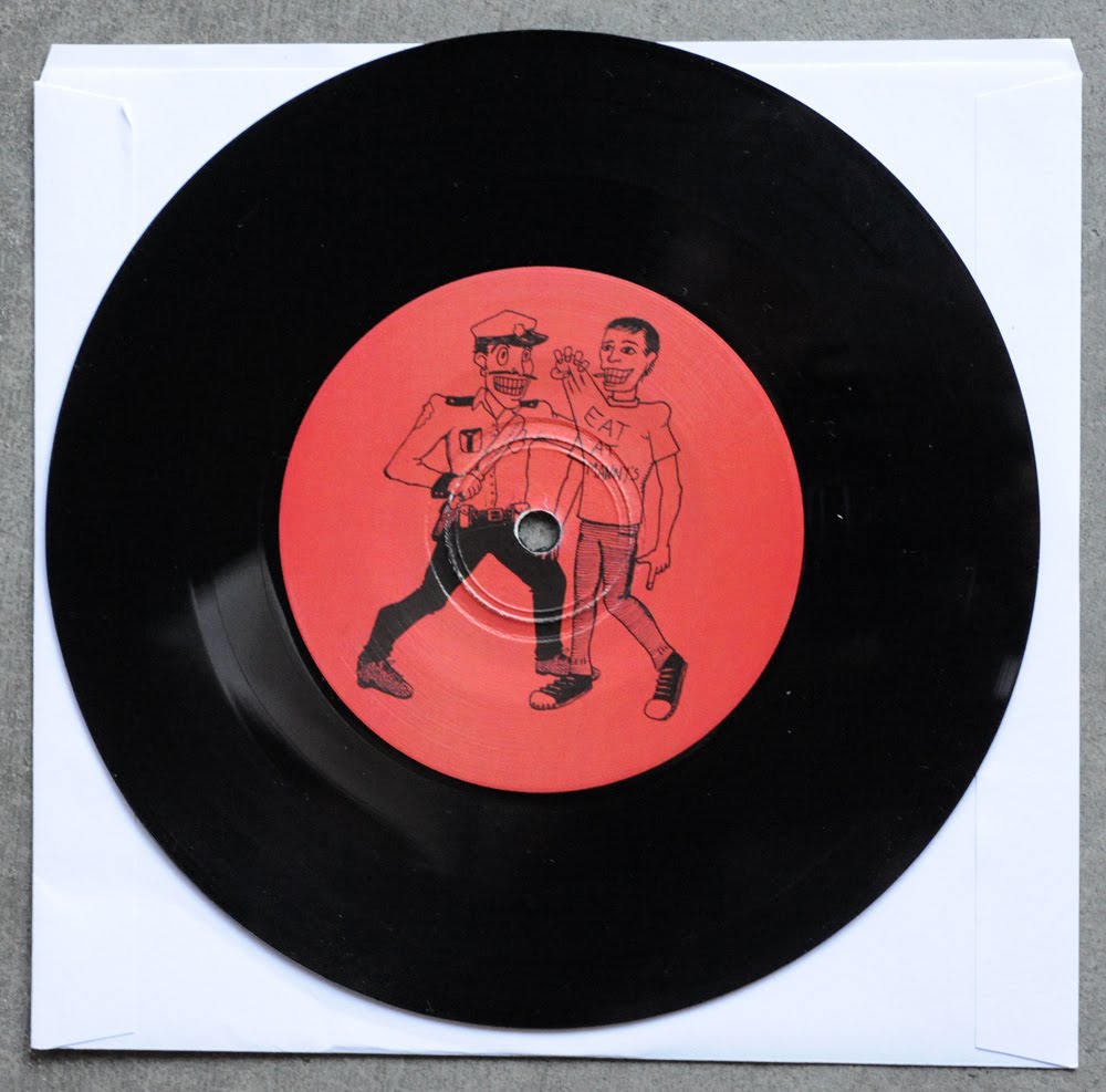
these are some really nice A and B labels too. they have a perfect balance of being hand done while still retaining a strong sense of design and clarity....


i should also mention that this comes with a free download card which also contains a few of their earlier ep's in the folder, so it is well worth your money! support good labels and cool bands....

Sunday, October 16, 2011

New Poison Idea Poster....


i designed and screen printed these posters for the POISON IDEA show happening this week at Gilman, if you are in the bay area be sure to go stage dive for me when they play "just to get away"...

these are 18" x 24" 3 color screen prints on 120lb black linen duplex paper, and were made in an edition of 65. to see more of my poster work, go HERE.

Friday, October 14, 2011

Neo Cons Ep...

Neo Cons are a great band from the bay area that released their 1st ep on Deranged a few months back. i feel like this is a good contemporary punk layout and thought the cover art was rather intriguing (not to mention fitting for a band called Neo Cons). it makes good use of found elements and photo copy type, yet was polished up a bit from a standard cut and paste job. it even has a touch of design to it....


back cover is on a similar tip as the front... nice touch of design worked in here and there, but still looks really easy and approachable. the song titles were handled perfectly too! these are professionally printed and glued covers on a uncoated cover stock.....


this comes with a black and white photocopy 6" x 6" insert as well. on the front side you have a band photo (by Martin Sorrondeguy) and some liner notes....


flip it over and you have the lyrics.... the "rotate the lyrics to each song" bit is always a good game...


A and B labels bring a touch of class with the silver, looking cool!


check these guys out live if you have the chance, they are great!

Sunday, October 9, 2011

Career Suicide - Cherry Beach Ep...

FINALLY! a new record from my favorite band of the last 10 years.... Dirtnap released the U.S. version of Career Suicide's "Cherry Beach" ep, which was previously only released as a tour 7" in limited quantity. along with an altered track listing, this new version also comes at you with all new artwork and packaging! Dave Neeson is the man credited for all the naive illustrations here, and i think they're great! how fucking fantastic is this cover art!?!? surf's up little buddy...


also, can i just say (since this is the first Career Suicide record i've had the privilege of posting on this blog) how fucking epic the career suicide logo is! i mean, it's like perfectly clever without coming off forced at all. it conveys good design and punk attitude in one effortless motion, which is not easy to do.

these are professionally printed and glued covers on an uncoated cover stock. on the back cover, another great illustration! this one is an even more involved scene with even more ridiculous shit going on. i like the pop color, especially on the bottom of the layout, but the cascading track info is pretty cool too.....


these also come with a professionally printed and folded up 11" x 17" insert. on the front facing side is a poster version of the cover art....


flip it over for the liner notes and some tour photos. a couple more tiny illustration got sprinkled in here along with the hand written type! jonah and martin credit themselves for the layout, which i am always a huge fan of. DIY or die people.....


A side label is a bit of a miss for me. i can see where they were trying to go with this, but it feels really unbalanced.....


B side label might be my favorite illustration out of the whole bunch! fucking cops....


this is a great release, now go get it....

Saturday, October 8, 2011

Bane / Defeater / Miles Away Tour Poster


i was asked to design and screen print these tour posters for Bane, Defeater, Miles Away, and Dead End Path for their month long U.S. tour. these are 4 color screen printed 18" x 24" posters that were made in an edition of 175 prints. they will be coming to a town near you starting monday so be sure to go check them out... and hey, grab a poster while you are at it....

to see more of my screen printed show posters, click HERE.

Wednesday, October 5, 2011

All Pigs Must Die - God Is War Lp

a few months back, all pigs must die released this LP on Southern Lord... once again, they enlisted the help of florian bertmer to handle the visuals. the front cover boldly features his beautifully meticulous line work that he has become so well known for. i really like the wavy line work he used to create the background, it creates a nice feeling of depth and movement....


this is a gatefold jacket printed on a heavy uncoated cover stock, and for whatever reason, it feels very substantial when you are holding it in your hand. it has nice weight to it and also just generally feels well constructed and sturdy.

the back cover art is a little underwhelming. don't get me wrong, it looks great... it's just not really grabbing me as an awesome panel. it looks as though only a small section of this piece was illustrated and then that was digitally repeated to form the art. again, nothing wrong with doing that, but if feels like a bit of a missed opportunity given the enormous talent he has for originally detailed renderings. i do really like the blown out and over saturated old english typeface that he used for the song titles...


here is a shot of the gatefold opened up to reveal the lyric sheet. left panel is a tie-back to the back cover art, the right panel is all lyrics. i like the typesetting here, everything is very clearly organized and looks good while delivering the information in an easy to read manner...


yeah, clear vinyl... no big deal....


this record is great, definitely check it out if you haven't already heard of these guys...

Tuesday, October 4, 2011

NUN UN Demo

along with Hole In My Head, Nun Un were on tour through the LA area last week and had these rad cassette tapes with them. these covers are 2 color screen prints on a pink uncoated paper...


i really like the way the mixing of patterns and colors come together when you turn the tape over and see the end of the tape insert sitting next to the cassette....


here is a shot of the insert panels unfolded, classic cut and paste art via some punk screen printing. it's always the simple things that look the best....


there is also a folded up 2-sided lyric sheet insert included. on the outside is an enlarged and cropped crossword puzzle. meh...


on the flipside, you have some beautiful photocopier artwork! 2 totally random panels side by side, looking awesome. fuck, i love that NUN UN typography that they came up with too....


here is a shot of just the tape.... it's kind of boring on it's own, but when it is housed in the cassette case it works so well with the cover!


awesome job guys...

Saturday, October 1, 2011

Hole In My Head....

played a cool show here is LA this past thursday with 2 bands on tour from vancouver.... Hole In My Head had some rad tee's that their drummer made the art for and i love what he came up with! really sweet illustration for a front print.....


and then the band name on the back in a shadowed knock out...


they also had these demos with them.... similar concept to the t-shirt graphic reduced to a simple spray painted pictograph is on the cover....


the sleeve unfolds to display liner note info on the front side. "clean and easy" is the name of this game...


and then also has lyrics on the inside panel. i like the way they blew out that typewriter text on the song titles as a way to make them bolder...


hand written sharpie on the tape, so punk.... reminds me of my youth....


check these guys out on the rest of their tour as they make their way back north, they put on quite the live show! also, you can check out their bandcamp site....