Thursday, December 29, 2011

The Holidays...

I really thought I would be able to bang out a post or two while visiting family over the holidays, but it's not looking likely at this point. Between all the travelng, visiting, and screaming little children i just can't seem to get the "quiet time" i need to write a review. Look for new entries on here starting January 2nd....

And in the meantime, be sure to check out and follow my other blogs which are both updated daily...

California Daydream is my iPhone image feed, usually a couple new images made every day.

Focus On The Negative is my daily drawing blog, one new drawing is posted every day.

Wednesday, December 21, 2011

Scum Again Ep....

Toxic Pop Records sent over this Scum Again Ep for review, this thing has some insane cover art... No credit as to who made it, but it's signed "Wren" on the back cover. This is a great humorous illustration that's been handled in a "classic punk tradition" sort of way. Raw, loose style with the right level of finishing to keep it looking legit, while the subject matter pokes fun of current political and popular culture events...


The back cover is another great illustration with a similar theme as the front cover. Be sure to click into these images and soak up all the hidden little details, cause there is a whole lot going on...


These covers are black and white offset printed on a coated stock and are folded but not glued. Open up the sleeve for the insert which is printed on the inside of the cover. This insert was designed as two separate panels despite the fact that they could have been one spread, but oh well. It looks like they divided the sides to be A side and B side dedicated panels, each with their own humorous illustrations to support the lyrics....


red vinyl with a perfect match red printed record label. That is awesome! Just red vinyl would have been ok, and just red labels would have felt out of place since the rest of the layout is black and white exclusively. Together, this is hot shit...


Pick this up from Toxic Pop directly....

Sunday, December 18, 2011

Divided Heaven...

i've been making a lot of art this year for the Los Angeles solo project of Jeffrey Berman known as based Divided Heaven, first up is the debut release that came out on Paper And Plastick Records a few months ago. this is a full color offset printed digipack sleeve with 6 printed panels, have a look...


back cover...


this shot is with the front panel open, the inside panel closed....


both panels open...


and the disc face, which the printer did not bother trying to color match to the rest of the art....


i also recently made two t-shirt designs for Divided Heaven to support the aesthetic of the cd art....


and last but not least, a sticker....


to see more of my art for bands, click here.....

Monday, December 12, 2011

Tenement - Taking Everything Ep

Got a rad submission package from Toxic Pop Records the other day....Tenement put together another great looking record with the same personal style and aesthetic they established with their earlier releases. For the cover art, they came up with a cool composition based on found vintage photography. it's sort of a four-panel study of human gross-ness...


The loose layout of the images mixed with the simple typewriter font setting really add to the charm of this cover art. The back panel is rather moody and dark in comparison, quite a compelling composition. A single photo obscured by a black shadow over half the image with no type to speak of except for the Toxic Pop logo. I love it....


These covers were full color printed and folded, not glued. there is also a black and white 6.5"x6.5" double sided insert included. On the front side of the insert is a fucked up found photo of some dude with his face rotting off, and i have to say that I'm never really a fan of this style of shock imagery. I feel like the back cover composition is a perfect example of how you can achieve a "dark and mysterious" vibe with out actually showing the most gnarly imagery you can find in a medical book. Not to single this record out or anything, i've just been noticing it more and more lately and felt it should be noted... This is also where the liner notes live, and I like that the type setting remains consistent to the front cover.


O the flipside of the insert is where the lyric sheet lives. I'll call this the lyric sheet side despite the fact that the combination of the size of the typewriter font and the photocopying make this pretty near impossible to read. Still, I do like the breakup between the images and the type here...


A side label has another random and obscure photo mixed with some hand written type, it's a winner! This actually might be the first time I've ever wished for a small hole on a 7" just so I could see more of the label art....


B side label is also photo based but this one gets a little too literal for me. Who are these dudes? Why are they staring off inn opposite directions? I just don't know...


solid release, thanks for the submission guys....

Sunday, December 11, 2011

Night Birds - The Other Side Of Darkness

Here's a record I've been meaning to post up for quite some time now, the long awaited Night Birds Lp. they enlisted the help of photographer Max Ryazansky to stage a scene for the cover art that further cements this release as the "soon-to-be classic" record that it is musically. It's a dark and looming exposure that let's you see just enough detail in their faces to entice you while remaining abstract enough to keep you guessing. All the type was left to the marque floating above them. I like the idea of these men being overshadowed by their own creation, as though the very thing that identifies them also obscures them. This is the other side of darkness...


These covers were professionally black and white offset printed and glued, "standard issue" so to speak. The back cover is one of the many great live shots I've seen of Night Birds (photo by Keith Marlowe) as well as some hand-drawn song titles by Bryan Sculthrope to match back to the band name logo he originally created for them on their demo. The up-side to being an incredible live band is that there is never a shortage of kick-ass live photos lying around...


They went for a printed dust sleeve instead of a regular insert, which is always a classy choice in my book. Also black and white professionally printed and glued, on the one side you have an alternate image from the front cover photo shoot. This time their faces are revealed, further playing with the "other side of darkness"concept....


On the opposite side is a killer looking hand written lyric sheet. This thing is perfect punk style.... The hand writing varies quite a bit in size and character (slightly more organized in some places and then more free-form in others) and there are all these rad little naive doodles that were scattered throughout! It kind of reminds me of a Ramones insert, I wanna say Rocket To Russia....?


A side label is where the info goes....


B side label is the fun shot...


since I pre-ordered this thing like a good little record nerd, my copy came with a limited edition hand screen printed cover as well! this is a one color screen print of metallic silver ink on a raw black paper stock. These were printed in an edition of 210 and were available for pre-order only. Hate to say it but I think I actually prefer the high contrast screen printed version of this cover art to the actual photo real cover....


Half back panel with the song titles and the alternate photo from the insert. Same comment here as the front cover, I think I actually prefer the high contrast version now that I have seen both...


This is easily one of the best records to come out this year, be sure to pick up a copy from Grave Mistake directly if you haven't done so already...

Friday, December 2, 2011

Knifey Spoony Ep...

Knifey Spoony sent over this ep for the blog... their singer Steve 
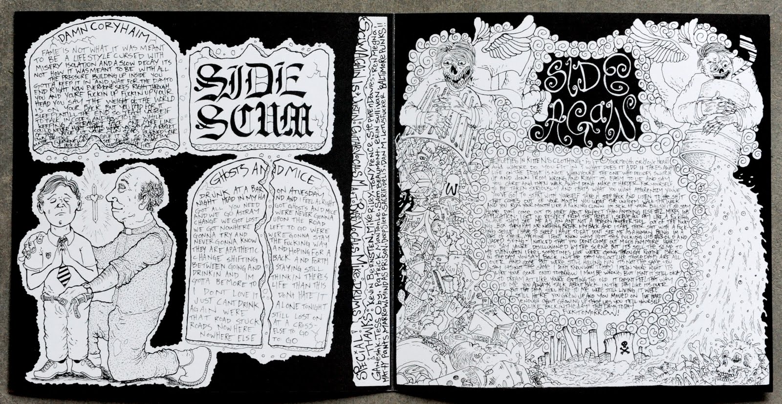
Oriolo worked up the art for this release, he was able to pull together a rad illustration that interacts with the package design. the cover art is actually a composite image made up of the insert revealed through a die cut in the front cover panel. man this shit is wild....


it's interesting to me how thoughtful the type on the front cover appears compared to the type that's on the back, which is a little clunky and cumbersome. that said, i actually like this half back panel mainly for that reason. it kind of reminds me of 100 different first wave DIY punk singles all at once...


here is a shot of just the insert without the cover, be sure to click into the pic to see the detail. the concept and style of this piece were rendered in perfect harmony for me. it has the right level of detail and humor for it to be both naive and competent at the same time, while still feeling loose and approachable....


there is also a lyric sheet on the back of the insert, not bad.... this panel also reminds me a bit of what i would expect to see on a first wave punk single, which is never a bad thing.....


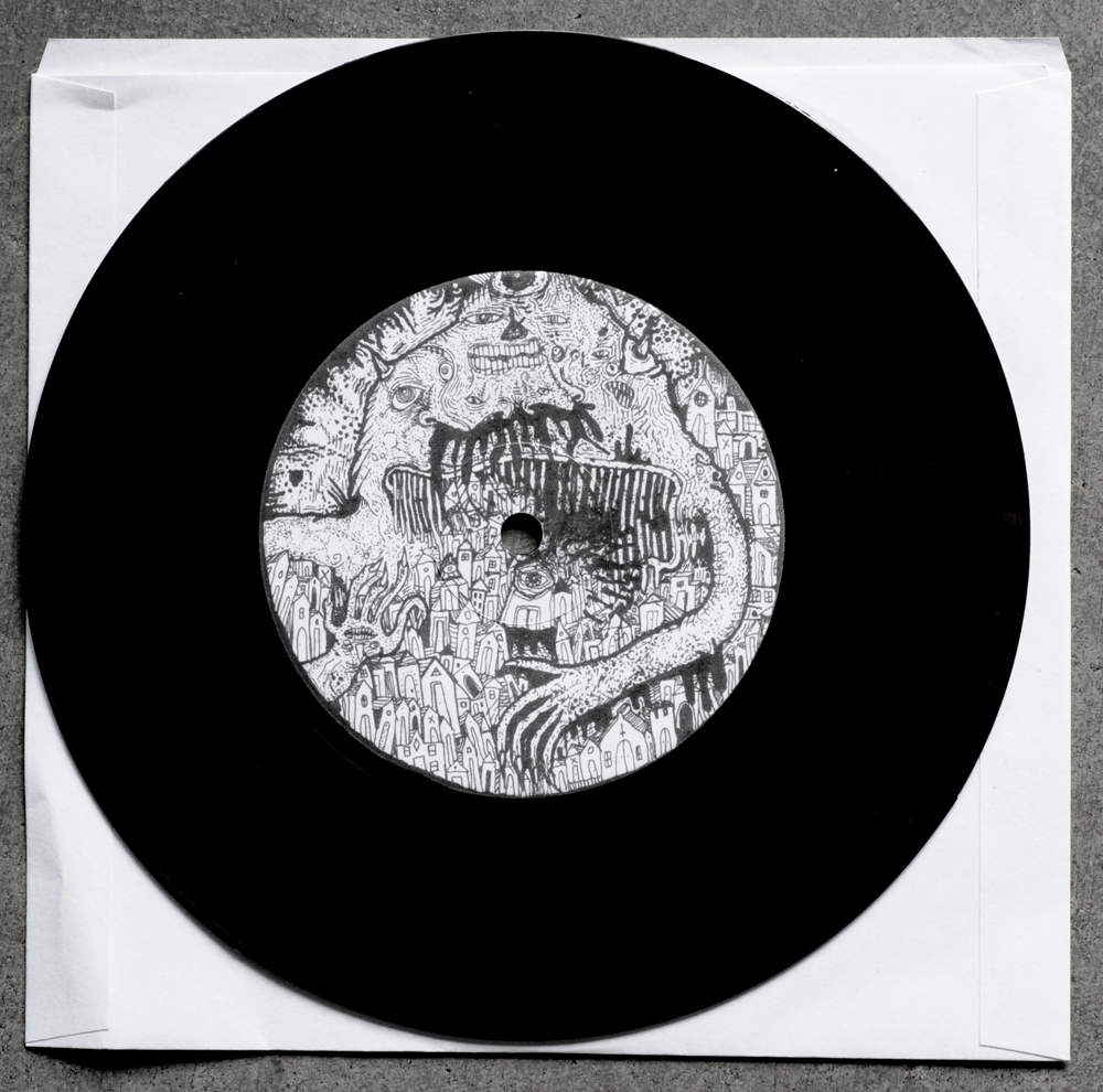
more fucking sick illustrations on the A and B labels, these things are great....