Monday, May 31, 2010

T Shirts....

this is the first post since getting back from Chaos In Tejas fest this afternoon. needless to say, it was an intense weekend out in Austin during the fest, and i have lots of things to talk about but it will take some time to sort thru everything... for tonight, i really wanted to get this post up though cause it was fresh on my mind.

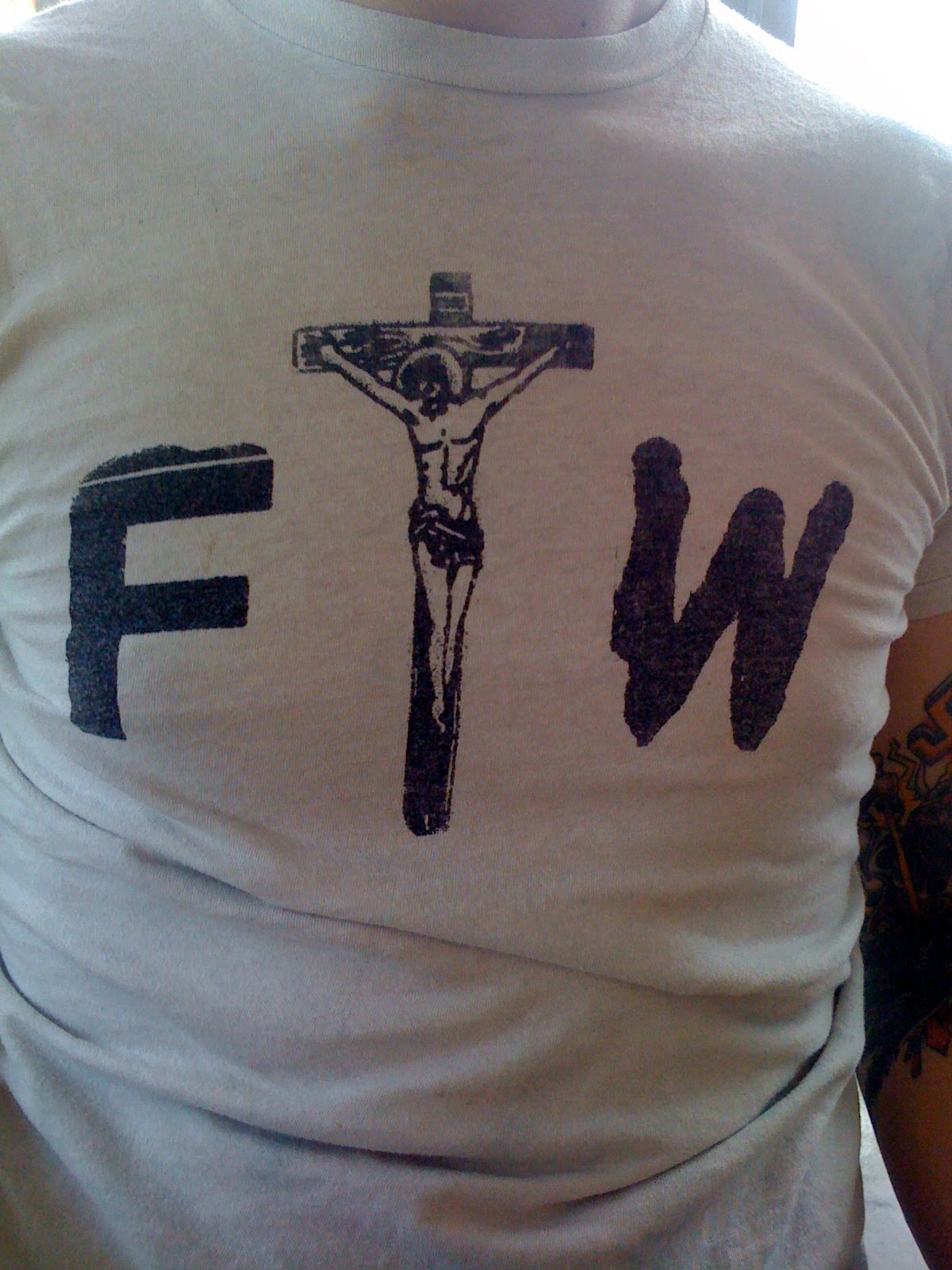
i know this is a topic the true punks love to roll their eyes and sneer at, but i'm going to talk about it anyway, cause to me this is inevitable. as long as there are punk bands, they will make shirts. as long as punk music continues to evolve and trends form within the sounds, the punk t shirts will too evolve to fit the trend. sorry if that's not cool of me to say, but i've seen way too many trends come and go within the DIY punk and hardcore community to think otherwise. on that note, here are some tee's i saw over the weekend that i thought were totally rad. lots of crude hand drawn graphics and type everywhere, which i love seeing on tees! also a few in there with some abstract photo imagery too. is it a trend? who cares, these shirts are awesome.... i was just snapping these with my phone so please excuse the quality.


Sunday, May 23, 2010

Marked Men Poster...

i just finished up designing and screen printing these posters for the Marked Men show at Beerland during Chaos In Tejas this next week. 18" x 24" 4 color screen print on 100lb cover stock paper. i made an edition out of 80, so hit me up at the show if you want one, there should be enough to go around....


this poster is Screenin 4 A Change # 96, to view more posters from the Screenin 4 A Change series, click here...

Tuesday, May 18, 2010

DEFEKTORS - Bottom Of The City Lp

i mentioned in that last post about VAPID that they were on tour from Canada with DEFEKTORS, so i figured that was the perfect segway for me to post their Lp next....

awesome collage work of some found skulls and newsprint that was printed on a thick matte glued sleeve. almost feels like a white chipboard? weird. no insert or liner notes, but it does give an art credit to Andrea Lukic. awesome stuff.


really like the way they organized the type on the labels too. when in doubt, stamp that shit out on a typewritter people.....


this one is also available on Nominal Records...

Monday, May 17, 2010

VAPID.


picked this 7" up 2 weeks ago when my band played a show with Vapid and Defektors, both on tour from Canada... wasn't that impressed with the LP, but this record is great, right down to the packaging! seriously love everything about this layout.... the bold and in your face fonts of the front and back cover, the way they tie in the stripe detail of their logo into the lyric sheet in a playful way... and their use of color pops on the label and lyric sheet despite the fact the cover is black and white. that is something i would not ever do in a million years on a record layout, but it totally worked here!


go to Nominal Records for more....

Gig Poster Show During Chaos In Tejas!

if you're planning on being in Austin next week for Chaos In Tejas, be sure to check out this art show happening in the area! it is an entire show dedicated to the Gigposter art of myself and Jack is the Barfield. i'm told the show willl be up thru the weekend of the fest, but the opening is not to be missed....

Wednesday May 26th, 7pm
The Parlor @ Hyde Park
4301 B Guadalupe
Austin, TX 78751

X - the book...

picked this little guy up from an artist book store on Fairfax in LA this past week while out on an inspiration day with my work crew. i'm pretty sure this book was produced in support of an art show in Manhattan that was focused on the X as a symbol and its involvement in the punk and hardcore underground movement. at a mere 5" x 7.5" and 112 pages, this little guy really packs in the content! every page is carefully layered and grouped semi-chronologically in an attempt to make sense of this symbol. clearly a work in progress, but i know i'm excited to see more....


Monday, May 10, 2010

Airfix Kits...

Airfix Kits recently released these 2 7" ep's, and it wasn't until i had both of them in my hands that i began to appreciate their aesthetic. Both of these records take a very "no frills" approach stylistically while displaying a subtle sense of humor about themselves. "Playing Both Sides" uses original photography for a literal depiction of the title track, while "Flex Time" uses found images to create tongue in cheek references to the working world. i really like that both records kept their layouts to strict 2 color pallets even though they were both CMYK printed, and that the A/B labels are exactly the same type lock ups..... have a look.


pick up "Flex Time" from Deranged and "Playing Both Sides" from Dirtnap.

Thursday, May 6, 2010

Thurneman - Tegelsten For Tegelsten ep

this record is great! Sweden's Thurneman newest release on Sorry State Records does a perfect job of capturing all the raw energy and enthusiasm of their music in this layout. awesome cut and paste style in every aspect of their imagery down to the A and B labels. i love how photo-based this layout is, and that it manages to remain very informal and DIY . i mean, look at those band photos! those guys are having fun and don't give a fuck!


covers are offset printed and glued (thank you for not "just using black", by the way) and the insert is a photocopy fold out.


i think the record labels are my favorite part of this layout.


Southside Stranglers - Too Much T.V. 7"

pretty slick little layout here on this Southside Stranglers Debut release. black and white stark imagery printed and glued matte sleeve with some die-cut flair on the back panel!


classy looking A and B labels too!


yeah, really classy, and then the insert is 100% punk just in case there was any doubt as to whether or not these guys were legit....


yeah, pretty awesome release! pick one up from Grave Mistake / Vicious Circle....