Wednesday, July 28, 2010

Pierced Arrows - Descending Shadows LP

this one is not so new anymore, but i really love the layout to this Pierced Arrows LP.... the art was done by Simone Müller, who did a brilliant job putting together this front cover collage out of live band photos. i absolutely love that there are all these abstract images going on in this piece, yet there's no real focal point to the cover other than the typography. that said, when these abstracted dark and moody live photos are all arranged together, they create a very powerful and personal portrait of the band. note the little drawn in pencil sketch that has been cropped into the top center.... that simple hand done element adds a lot of personality to the art while complimenting the hand done type.


the back cover is loaded with even more of those really nice personal touches every where you look... the Side A and B icons up in the left corner, the track denotations with the little arrows next to them, the word "credits" being hand written... all combined with neatly typed lyrics and another abstract band photo....


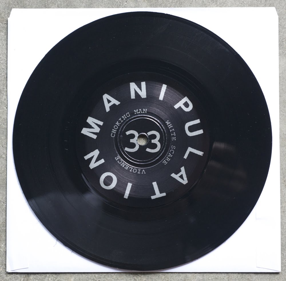
in case you were wondering, this is what it looks like when you are able to perfectly transition the mood and style of the record jacket onto the A and B labels... god damn, i love that cropped / tilted typeface they use for their name... so good!


this is out on Vice Records (weird, right!?!?), you can get it here..

Sunday, July 25, 2010

Focus On The Negative Art Zine Vol. 1 OUT NOW!


i just finished putting together the first edition of the first volume of Focus On The Negative in art zine format. i started the Focus On The Negative Blog this past month as a place to put all my daily drawings that don't get used in any of my other work, and i have been enjoying the process so much i decided to put together a small run of handmade art zines to sell....

this is a 5.5" x 8.5" 24 page art book printed on light grey paper. the cover page was printed on an 80lb dark grey cover stock paper and then individually altered with blue spraypaint. the whole book was then stitched with a matching blue thread and packaged in an archival resealable bag. you can get your copy for just $12 shipped anywhere in the world by clicking the button below....


Saturday, July 24, 2010

Stereotype Art Print Now Available....


i just completed another art print this past week. this one is also 18"x24", and is a 4 color screen print made in an edition of 40. to see more of my screen printed art work, click here.

or, you can buy this print for $30 shipped anywhere in the world by clicking HERE


Thursday, July 22, 2010

Rorschach - 2x Reissue Lps...

Gern Blandsten put out this beautifully packaged double LP reissue of the remastered Rorschach LPs just in time for their reunion shows which have taken place a few times over the past year. god damn, i love gatefolds! i wish i owned more of them that were punk records, but unfortunately they are pretty expensive to produce, so many bands and labels don't consider them an option from a cost perspective....

the layout for this release is very clean and calculated, a true exercise in minimal design. the front cover is a very slick collage of live Rorschach images captured from video stills and then cropped within the bands name typeset with a chunky typeface... what a great way to capture the raw energy of their live sets and present it in a way that pulls you into the design! the abstraction of the energy from the scene leave the viewer wanting more, like i kinda wanna go look for old live videos on youtube now....


view of the gatefold open to reveal a clean lyric sheet organized in columns with more video stills...


back cover is pretty straight-forward, just song lists with another nice video still neatly organized and presented with perfect style.....


blood red 180gram vinyl, FUCK YEAH!


oh yeah, sounds incredible too! go get it if you ever liked this band even remotely.

Saturday, July 17, 2010

Red Mass - Ep

This one came in as a submission from the good dudes over at Wallride Records. love love love the illustration style of the front cover! seriously can't get enough of it.... really wish there was a cover art credit listed in this record so i see more of this persons stuff.

the cover of this record is an offset printed fold-over sleeve. pretty common, however, it was a really smart idea to wrap the cover art/band name so that it continues ever so slightly to the back panel. that simple gesture takes this otherwise ordinary folded cover and transforms it into something way more interesting and unique feeling.


love how empty the back panel is, nice balance of negative space between the front panel wrap and the logo....


like the idea of the turned obscure photo for the insert, but this typography is feeling pretty clumsy. literally ANY other font for this insert would have been a better choice. it almost lessens the coolness of the photo, cause it makes the layout feel really thrown together and not so calculated....


finally, a round of applause for the big chunky typography on the A and B labels....


Tuesday, July 13, 2010

Rayos X - Demo Cassette

another great demo i picked up recently from LA's RAYOS X.... they too went the screen print layout route with their release as well! printed on a light weight chipboard style paper stock, this three panel insert was hit with a single color screen print on both sides. visually, this is hitting all the right notes for me! a true cut and paste aesthetic comprised of found imagery, hand made typography mixed back with typewriter texts, blown out band photos and photocopier noise... and what's punker than an all black cassette tape? ...nothing.


Sunday, July 11, 2010

Tuberculosis - Demo Cassette

Los Angeles is on fire right now.... with a whole new crop of kids forming new bands, 2010 is looking to be a very promising year for this city in the DIY punk and hardcore scene! among the greats are Tuberculosis and their essential demo cassette. i've been in tons of bands in my time, each of which released demo's on cassette, and none of them ever came with a screen printed insert! that's kind of an embarrassing admission for me to make as an artist who owns a screen print studio....


single color, 2 sided, 1 panel insert on what feels like 80lb watercolor paper. 100% awesome. when i got this from them i was told they ran out of the photocopied insert that was supposed to go with this, so whenever i can track that down i will post it as well. if you live in the LA area, look for this band!

Thursday, July 8, 2010

MANIPULATION

got this record in the mail last week from an old friend and i've been dying to get it up on here ever since. these guys play brutal, fast, aggressive hardcore (for fans of The Fix) and have put together one hell of a layout for this release. the sleeve is a white screen print on black heavy card stock, folded, not glued. as a person who knows a thing or two about screen printing, i have to say who ever printed these did a great job! ....not your average "printed on you mothers kitchen table" style punk screen print over here.... nice use of dark and abstract front and back cover imagery, the front panel being a bit of a collage as well!


photocopied insert is a band photo collage ala digital blend...


back of the insert is a beautiful display of lyrical content and i'm guessing some intentional photocopy noise added as a design element. very slick...


soak up the big bold typography on the A and B labels....


go order this from Fashionable Idiots, you won't regret it.

Tuesday, July 6, 2010

Twin Cousins 7"

got another awesome submission for the blog this past week! i love submissions! really, i do. thanks to Josh for sending me this...

Twin Cousins just released their debut 7" with these beautiful letterpress covers on chipboard.
i love the way letter pressed papers feel in your hand, nothing else printed has that great texture. the front cover looks like it was put together with some old wood cut letters, the back looks to be more modern, maybe from a digital plate (nothing wrong with that, just saying...). seriously, i am such a sucker for big rich typography, this is an A+ cover choice in my book!


back panels are stamped out of 100 under the back panel letter press plate.


great full color print of a creepy and visually disorienting collage on the front side of the insert, back of the insert is a nice little writing, you should read it.....


shit colored vinyl. no shit. hey, they like a consistent color pallet... i can't hold that against them! but i would have LOVED some of that rich typography from the front cover to have been on the A and B labels too! so what if it would have been faked.


Monday, July 5, 2010

BAD MAN Art Print....


i just printing my first new art print for 2010.... which is kinda funny, since i've designed a few so far this year, yet i just haven't had the time to put any of them up on my press!

so here is BAD MAN, he is a 6 color hand pulled screen print poster on 18"x24" 100lb cover stock paper.

i made this print in an edition of 40, you can purchace one by clicking the button below.
to see more of my screen print work click here...

or to buy this, CLICK HERE

Sunday, July 4, 2010

Southside Stranglers 2nd Ep....

another cool looking release by the Southside Stranglers. this one is a little less fancy than their debut ep, but still a nice package. front and back cover art looks to be layed out entirely on a photocopier ala 1979. all the typography is hand scrawled in a way that is reminiscent of your favorite high school notebook that you wrote all your favorite bands names on. everything about the art and layout of this record comes off as intentionally naive, but not too forced, which is a delicate line to walk....


turning the front cover to read off-angle was a good call, makes the photo imagery much more interesting.


couldn't even bother straightening out the text on the top of the back cover!


labels are entirely hand done as well. awesome!

you can get this from Fashionable Idiots.