
when i heard that NYC based Obits would be releasing their second lp this year, i was almost as excited to see what it was going to look like as i was to actually hear it! front man Rick Froberg loaned his art skills once again to grace the cover of what will surely be another classic lp to add to his already impressive catalog of hits.
this record is a bit of an aesthetic departure from his usual layered illustrative style, but still remains an excellent exercise in graphic design. throughout the layout, there are subtle details added in to create the effect of a misprinted or out of registration print job. on the front cover image, the art slides down slightly on an angle from left to right while the type remains straight on, and there is a magenta shadow built into the art to create the illusion of a printing error...

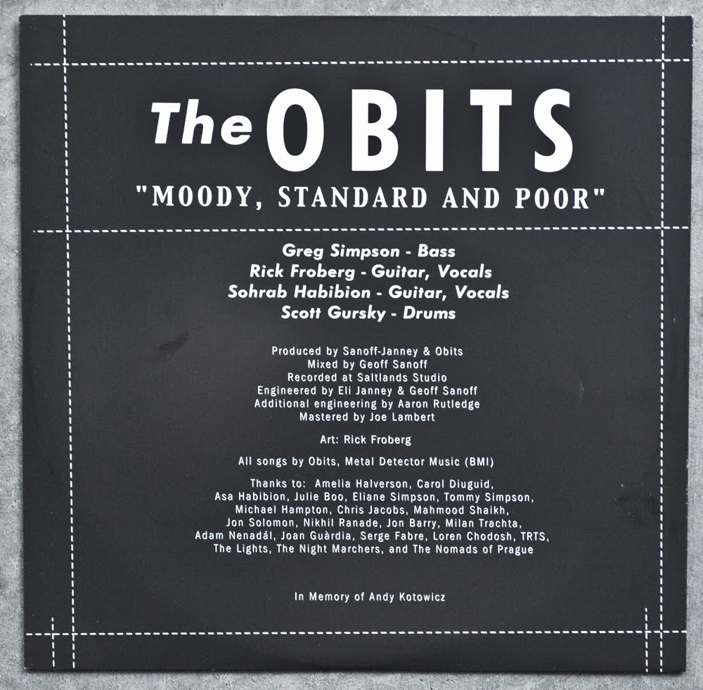
i absolutely love the way Rick works with mixing his typefaces, and this back cover panel has got it going on! the altering between the italic and the condensed font styles makes for a pretty dynamic read, and look at that line of copy type running up the left side of the sleeve! that copy holds the whole composition together. the magenta being nudged out of registration looks really killer here as well....

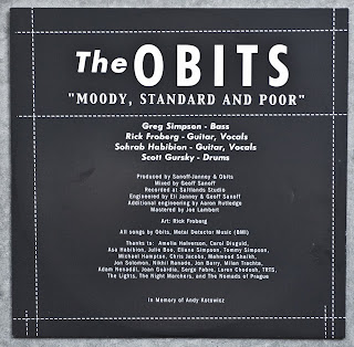


instead of an insert, they went for a printed inner sleeve, which is always a nice touch. the simple, bold, black and white panel is a nice break from the loud colors of the outer jacket. liner notes rarely look this good....
lyrics would have been cool, but i guess they would have been pretty small.... it's kinda interesting that the inner sleeve was printed on a coated gloss paper and then outer jacket was printed on matte stock, it's kind of the opposite of what you would expect...

pretty sure these A and B labels are the Sub Pop standard issue, can someone confirm in the comment section?

yeah, all the LP's I have on sub pop have the same labels.
ReplyDeletealso... Rick Froberg is the best, the Hot Snakes LP's are still some of my favourite sleeves.
ReplyDeleteit is the opposite colors as the standard Sub Pop label. Here is an example of the label standard: http://friendsound.files.wordpress.com/2010/03/shed-label.jpg
ReplyDelete