these covers were printed on a really nice 100lb uncoated cover stock and were then cut and folded. the back cover features 3 photos of some of Buzz's sculpture work with his hand written type. just like the front cover, keeping the art small and centered in a sea of black space makes for a very impacting design....
unfold the cover for the the lyrics, this is "type as composition" at its finest....
A and B labels were kept clean and easy, each with just the essential information on a black label. the black record sleeve was a nice touch too....
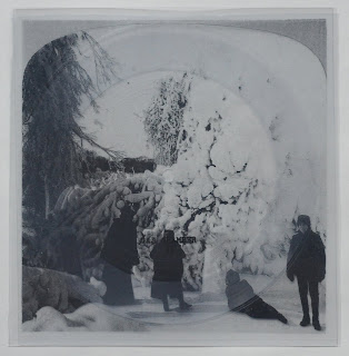
this next record is an awesome clear flexi that comes packaged with a transparent insert. the grooves of the record laying on top of photo on the insert actually creates a pretty cool overlay effect. while there's not a whole lot to look at, i feel it's a pretty memorable record....
here is a shot of just the insert. i have no idea what is going on in this photo, if it's a pic that the band created themselves, or just some random creepy image. it actually would have been really cool if they had worked some liner notes into this insert in a creative way....
here is a shot of just the flexi. again, i like the minimalism here, but maybe a song title or two would have been good....
last but not least, there was an amazing wood cut art print included! this 12" x 14" poster was relief printed in an edition of 15 on a delicate rice paper. the combination of the thin coarse paper and the pressed markings from the printing technique bring a rich textural quality to the finished piece when it's in you hand. really nice work...
big thanks to patrick for sending all this along, be sure to check out the Gas Chamber page to grab your own copies!


No comments:
Post a Comment