
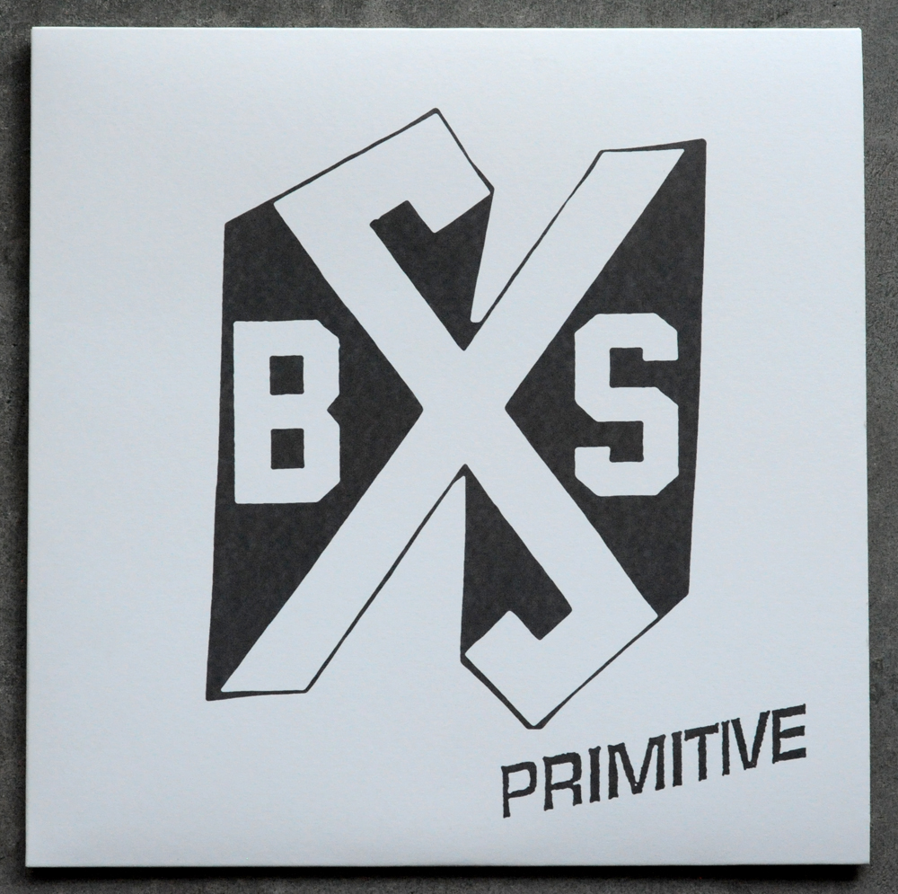
here's a record that i'm sure none of you have seen yet... this Boston Strangler lp has been one of the most anticipated releases of the year, and i have to say i think the hype is well deserved. this debut lp is an excellent example of classic boston hardcore both aesthetically and musically. take for instance the cover art... the Boston Strangler logo they came up with is bold and iconic, certainly on par with any of the early pictographs created by the first wave of hardcore bands. i really like that all the linework is meticulous in execution, yet still shows evidence of its hand crafted origin. there is also a softness to all the imperfections that is indicative of flyer art that has been xeroxed 100 times over, which is a definite benefit...
on the back panel there is a more obvious example of the over-xeroxed effect in the brick wall photograph, and the hand written song tittles are super shitty to the max (i mean that in in the best possible way). this type has plenty of size variation and personal character, and their haphazard placement on the panel really gives it that classic punk charm...

there is a folded insert included as well that really reminds me of some old hardcore fanzine i owned at some point, but can't quite put my finger on.... great photocopy cut and paste design, and it looks really nice with that second color happening behind all that black. i am guessing these are just full color photocopies on a 100lb uncoated cover stock of paper...

here is a shot of the insert unfolded, it's a pretty standard lyric sheet, extra points given for actually typing up all the lyrics with an actual typewriter...

oh boy, check out this band photo collage happening on the back page of the insert. i mean, i love this in theory, but the quality of some of the images is less than ideal. it is nice to see that it looks as though they made it with actual photos and some scissors instead of just in photoshop. this thing is punk as fuck....

A side label has a nice consistant approach to the cover art, and even borrows the over-photocopied texture from the back cover panel to give the labels a warmer feeling.


No comments:
Post a Comment