
This one came in as a submission from the good dudes over at Wallride Records. love love love the illustration style of the front cover! seriously can't get enough of it.... really wish there was a cover art credit listed in this record so i see more of this persons stuff.
the cover of this record is an offset printed fold-over sleeve. pretty common, however, it was a really smart idea to wrap the cover art/band name so that it continues ever so slightly to the back panel. that simple gesture takes this otherwise ordinary folded cover and transforms it into something way more interesting and unique feeling.
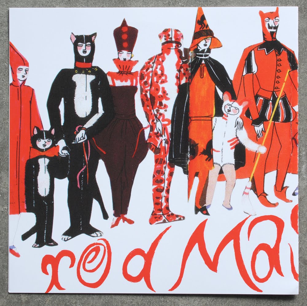
love how empty the back panel is, nice balance of negative space between the front panel wrap and the logo....

like the idea of the turned obscure photo for the insert, but this typography is feeling pretty clumsy. literally ANY other font for this insert would have been a better choice. it almost lessens the coolness of the photo, cause it makes the layout feel really thrown together and not so calculated....

finally, a round of applause for the big chunky typography on the A and B labels....

No comments:
Post a Comment