
here's another really cool, really straight-forward layout courtesy of Grave Mistake Records that works well. it's actually one of the most simplex designs i've ever showcased on this blog, and i think that's a good thing. when designing a record layout, it's easy to get caught up in "the idea" of it, which can really be stifling to creative process. at the end of the day the only thing that really matters is that it looks good. in this case, this thing looks good because the layout is so naive that it looks like it was legitimately released in the early 80's. i mean, look at the cover, this record is called "do not resuscitate... it doesn't get any more literal than that for a cover image....
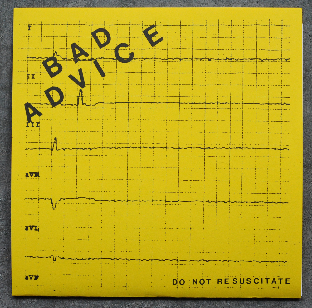
these covers are black and white photocopies on a yellow card stock, folded not glued. the back cover has a very obscured live shot paired with some handset helvetica type. all the info for the record is kept to the left side of this panel. i love that they kept the type small and went big with the kearning and leading, giving all the type a lot of room to breath within the design...

the A side label is straight up KBD single style at it's finest! all the type was banged out on that old typewriter that's been collecting dust out in the garage, and all the info was layed up and balanced quite nicely...

the B side label is just a live shot that has been photocopied to death, wonder why they left his face in the image since they intentionally removed it on the back cover....

this is a solid release, be sure to grab one from Grave Mistake with your next order...
thanks paul! just a nerd note, they are actually offset printed not photocopied.
ReplyDelete