Thursday, October 28, 2010

All Pigs Must Die 12" ep...

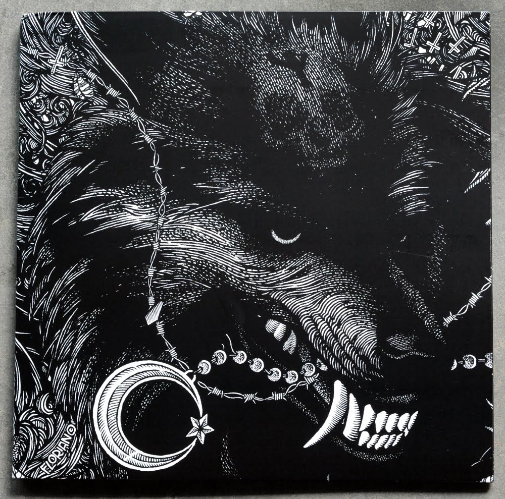
German artist Florian Bertmer did the illustrations for the debut release of boston based All Pigs Must Die that just came out.... to be honest, i'm not usually a fan of Florian's work, but i really thought this record turned out great and felt it was worth mentioning here. this 12"ep comes beautifully packaged with a gate fold sleeve which Florian took full advantage of with his mirrored wolf illustrations. here is a close up of the front cover....


...pretty bold move for a new band to leave their own name off the cover of their debut record. the only text anywhere on the outside of this jacket for that matter is Florian's signature! here is a shot of the back cover....


the man knows how to illustrate, that's for sure! here's a shot of the jacket opened


the inside panels of the gate fold take on a much more minimal and reserved design aesthetic than the front cover. Adam Wentworth put these together, and i have to say i feel like he made the right decision going sparse on the inside... it's a nice balance to all the heavy illustrations on flip side. the choice in font could have been a little more carefully thought out, but it's not stopping me from liking this...


180 gram vinyl sounds soooo good, it's always such a treat when the needle hits that record! A side label is simply the front cover illustration....


B side has the same very nicely crafted APMD monogram from the inside panel of the gate fold. apparently Florian also created this, which makes me wish someone stuck it on the front cover even more...


you can pick this up from the band's merch store....

Sunday, October 24, 2010

Video Violence Art Show....


i was asked to contribute to a rad group show going down in philly this weekend in celebration of cult horror films on the VHS format. "Video Violence" will take place during the annual "Exhumed 24 hour Horror-Thon" film festival this Halloween, and for one night only artists from across the country will transform the lobby of the theatre into a video store of defaced cult horror films. needless to say, i am very disappointed that i won't be able to witness this event first hand, but if you live in the area you should check it out! here is what i submitted for the show... this is a collage of screen printed scraps from my print shop, ink, watercolor, and acrylic paint.


October 30th-31st

the international house
3701 chestnut st.
philadelphia, pa

Saturday, October 23, 2010

Loose Dudes 12"

this one came in as a submission.... Chicago's Loose Dudes put together a rather loose looking record in true punk style. let's start with the screen printed covers, which actually executed very well! black and white ink on a pale yellow uncoated cover stock, and yeah, the print is very clean. really nice illustration of a pigeon hanging out with some trash for the cover, and in case that wasn't ridiculous enough for you check out that typography for the band name... i love a band that is comfortable with not taking itself seriously!


back cover is a half panel fold over with cut and past song titles. may i draw your attention to how rad the Hated Records logo is...


this insert is where things really get wild. there is some information on here, but basically it's just totally random drawings. the quality of these illustrations is all over the board (mostly inane doodles, but a few stand out cool pieces) , and some of the subject matter is rather questionable. what's even stranger is that this is a 2 sided 8.5"x11" offset print on cardstock, NOT a photocopy?


blank white labels with an A side hand stamp.... more and more bands are going for this lately, and i have to say i like it. it's a fun way to personalize the vinyl....


Saturday, October 16, 2010

Tenement - False Teeth ep

i came across this Tenement 7" in someone's distro at a show recently. i love the look of a crudely cut hand made collage, and this record has a lot of that going on.... take this cover art for example, if you look close you can see the mistakes in the slicing from the exacto and the natural shadows created from the difference in paper dimension when the art was scanned...


full color offset printed sleeve with a half back panel. i like that they thought about the fact that the insert would be seen at the top of the back of the record and designed it to match the back panel. lots of photos, i'm guessing all of the "vintage / found" variety....


full shot of the insert.... 2 sided black and white print.


back side of the insert was all typeset with a typewriter... i like that they left some good ol' fashioned photocopier noise in there!


A and B labels have more collage work.... A side works really well.


the B side feels forced to me. maybe it's the upside down crosses?


Tuesday, October 12, 2010

Bloody Gears Ep...

another great Boston release for the blog... Bloody Gears just recently released their debut 7" on Deranged Records. excellent abstract imagery for the front and back cover art that is perfectly paired with hand made typography throughout the entire layout. really love the "push / pull" quality of that Bloody Gears logo, it brings a lot of energy to their name. no credit as to who made it but my guess would be their singer jeff put it together. this is a full color offset printed and glued sleeve on a matte paper...


back cover is so powerful.... love the tiny box in the center of the layout for the lyrics and info. and yes, all those lyrics are hand written out to fit beautifully within the design. something about this layout is reminding me of a mid 90's record, possibly something on Gravity Records?... i can't put my finger on what record i'm thinking of but it's a good thing for sure.


A side label is going to give you all the info and look sharp doing it...


B side label is pure art, hang it on your wall if it ever leaves the turntable...


Tuesday, October 5, 2010

Libyans - Paralyzed 1 sided 7"

Boston based Libyans recently self released this rad little 1 sided 7", and the packaging turned out insane.... i'm guessing these covers were offset printed on vellum? it's a really nice effect actually, i love the transparency of the material and that you can see the record thru the cover. the mirrored image artwork works pretty well with this particular idea as well since it comes up to frame around the shape of the record....


this sleeve came glued shut on the backside, and the only printing on the back panel is a small block of type at the bottom.


A side label has a nice handmade brush typeset of the band name repeating, black on silver paper.


....and then BOOM! B side is etched with hand written lyrics, same brush type style as the A side label. god i fucking love the way etched vinyl looks......

there you have it... DIY punk package design at it's finest. since there are only 400 copies of these floating around i'm not sure if it's still available, but be sure to support this band if they come to your town....

Sunday, October 3, 2010

Cloak / Dagger ep...

keep forgetting to post this up.... i picked up this Cloak / Dagger 7" a few months back, and was surprised / stoked to find that the cover was screen printed! nice abstract front and back cover with illustrations by the bands singer Jason Mazzola, 2 color print job by Creative Panic. it's not exactly knocking my socks off, but i figured that there's something to be said for the nice clean execution of a solid and refined design job.... especially considering how many releases i come across that don't quite hit the mark.


this is a cut and folded cover, and then there is a small photocopy lyric sheet included as well. this lyric sheet is TINY! 4" x 4.25" to be exact....


no A and B label art, just a hand stamp of the band logo on the A side, which is actually a pretty rad idea....

check JadeTree.com for availability....

New Blacklisted Screen Print...


i just finished designing and printing these new posters for Blacklisted over this past week.... this is a 3 color 18" x 24" screen print on 100lb cover sheet. 60 prints were made, and they will only be available at the 2 free shows they are playing next weekend... so if you live in the Chicago or LA area and you want one of these, you are in luck!

this poster was designed using one of my brush pen sketches from my daily drawing blog, to see more of my drawings click here.

to see more of my screen printed poster work, click here.