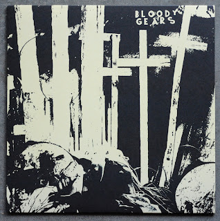
here's a record that i have been meaning to post up all summer, the long-awaited and epically great Bloody Gears lp... once again, their singer / guitar player Jeff totally knocked it out of the park with the artwork that he came up with for this record. on the cover we have a dark, moody, abstract image with the primary recognizable objects being some elongated crosses. i love how linear and textural this image reads, it's a beautiful pairing of noise and structure that seamlessly blend into each other...
these are professionally offset printed and glued covers on a uncoated white paper stock. i'm mentioning that the jackets are white because i really like that the art was built to have a subtle off-white yellow coloring to it that came thru beautifully in the printing. that was a really great way of taking black and white art and bringing it to a whole different dimension in terms of how the artwork reads to the viewer.
all the art on the back cover is neatly framed and floating within a sea of black. the combination of negative space and serif based typography bring this panel into Joy Division looking aesthetic, which is never a bad place to be. of course the main difference here is that the content of the actual art is quite abstract and far more interesting. i really love the line work in the image on the right side...
this record comes with a printed inner sleeve as well, which i am always a big fan of. on the one side you have another great composition comprised of 6 abstract images that have been displayed in a stack of strips and framed with the same serif typography used on the back cover. let me go on record saying this image would make for an awesome Bloody Gears shirt (wink wink). once again, nice use of negative space...
on the flipside of the inner sleeve you have the lyrics. these look to be typeset using an actual typewriter and then scanned and neatly columned. everything in terms of the layout looks great, but the shots of the members at the bottom of the panel are pretty bad. aside from being a little dark and lacking contrast, these were clearly taken post-set at a show, which never looks good....
next shot is of the A side label, not sure what the art is but it makes for a nice balanced composition. also, i love the light stroke of yellow on the outer edge of the label, looks classy....
B side label is also open to interpretation...
seriously, this is one of the best releases this year, don't sleep on it. get yours from Deranged.


No comments:
Post a Comment