the wonderful people over at Novelty Haus made these awesome limited edition merch packs for my shoegaze/noise pop band Kent State. using the art created by the lovely Emma Maatman for the cassette release of "Behind Closed Doors", they made up some limited edition 12"x12" 2 color screen printed posters on black paper, a t-shirt, 2 pins and a digital download card all packed up in a 12" record sleeve. unfortunately, i wasn't able to post this up before these all sold out thru Novelty Haus, but luckily there are still a handful for sale up in the Paranoid Futures webstore! check out the pics....
Showing posts with label cassette. Show all posts
Thursday, May 23, 2013
Thursday, February 7, 2013
SUSPECT - 6 Song Cassette
the 6 song cassette for my new fast hardcore band SUSPECT arrived in the mail this week from the tape manufacturer. our other guitar player Nick made 100 of these little guys to sell under his Paranoid Futures label. i handled all the art and design so i don't have a ton to say.... enjoy the pics!
to see more of my art for bands, click here
Thursday, October 25, 2012
X= - Home Recordings Cassette
good friend DK sent over the newest X= cassette he made this past month, and once again, i am absolutely floored by the package design. i would like to go on record saying that he is "the master of unconventional" as far as tape layouts go. no jewel case or no J-card to be found here, just some of the most innovative DIY packaging i've ever seen. there is a folded pale blue piece of cardstock that serves as a cover image siting on the top of the cassette inside of a plastic ziplock bag. the artwork falls on both sides of the fold, making a composite image that changes when you open the panel....
the art for this cassette reminds me a little of David Carson, where everything is very visually chaotic in a very controlled and beautiful sense of the term. here is a shot of the outside of the card unfolded. note how the typography is set to read facing both directions....
on the other side of the card, all the lyrics have been typed out and perfectly set in song groups that were then ever-so-slightly tilted individually. looks killer....
here is a shot of the side profile of the cassette with the folded cover card on top. i love that the end of the folded paper on the cover perfectly lines up with the sticker on the side of the cassette....
the cassette is made of a rather odd material, not quite sure what it is. its hard and solid like a normal plastic cassette, but it's as though it was left uncoated or something. it has almost a rubbery matte texture to it. no printing whatsoever on the actual cassette, just a glued piece of matching cardstock that wraps up to the top of the tape to create a side spine (shown above)....

Tuesday, May 22, 2012
Pure Scum - Demo Cassette
Sorry State Records sent over this cool screen printed demo by Pure Scum for me to check out... the whole layout is comprised of a two color screen print on an uncoated natural colored paper stock. the artwork is made up of heavily bitmaped imagery that's been further obscured by the black overprinting. it's basically one large image that spreads across all the front panels to create a textural visual landscape...
on the back panel you can see where some of the image abstraction really benefits from the folds of the layout. gimmie gimmie texture...
all the type in this layout is a bold and compacted font, here is a shot of the full cover unfolded so you can see the whole screen print and how the 2 colors interact with each other...
there is a one color screen print on the inside panel with another super abstracted and heavily bitmaped image. this is also where the tapes have been numbered out of 100. i don't know, i kinda see a face in this...
the cassette is actually quite nice looking... lots of nice clean type pulled together in an orderly fashion..
be sure to check out the rest of the Sorry State catalog for more solid releases....
Tuesday, April 3, 2012
Kent State - 3 Split Cassettes
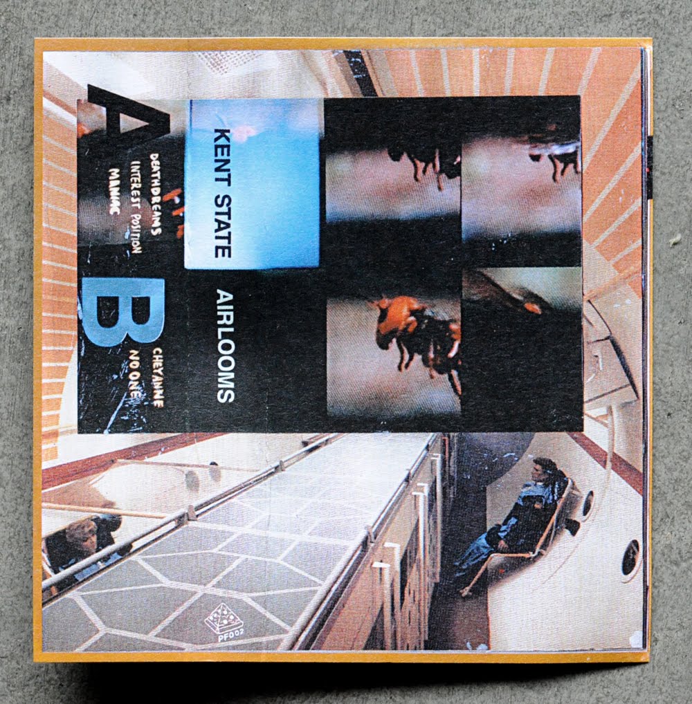
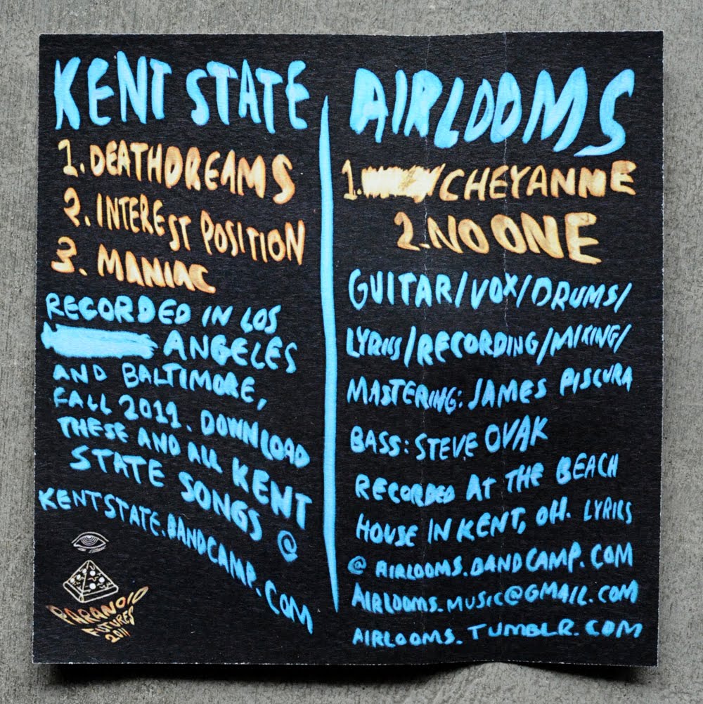
Kent State is a side project band that was started by Nicholas Vance of Deep Sleep with the help of his girlfriend Emma Maatman. I've been playing guitar with them the last couple of months since they relocated to Los Angeles and have been enjoying the process. These 3 new split cassettes were just released on nick's Paranoid Futures label and are available for purchase as well as free download from the bandcamp site.

Emma put together all the art for these 3 releases and did a stunning job! Beautifully obscured images of outer space getting the "front and center" treatment, as every cover gets its own collage art and hand written liner notes. There is also a fair amount of hand-set helvetica typography as well, which has been a consistent visual theme on all the previous releases. While you are checking out the photos below, look out for the playful way Emma utilizes color throughout the design....
Saturday, February 11, 2012
Ramlord / Condensed Flesh Split Cassette...
This submission came in recently and I was stoked on this cover art! I think the insert says that the art was done by "Thor Tornberg", but it's pretty hard to make out... Anyway, the combination of illustration and type is off the charts. Great detail, very imaginative, and while the band names are a bit tough to read I still love all the handwork....

Unfortunately, that cover art is where my love of this release ends, cause the rest of it gets a bit tough. Take a look at this back panel for instance... It's cluttered from a design standpoint and also a bit lop-sided in the way the elements were distributed...

Unfortunately, that cover art is where my love of this release ends, cause the rest of it gets a bit tough. Take a look at this back panel for instance... It's cluttered from a design standpoint and also a bit lop-sided in the way the elements were distributed...
The cassette is a clear piss-yellow plastic with a dark red screen print of the song titles. Although this was the best use of typesetting in this layout, no matter what lighting condition or angle you hold this in, it's nearly impossible to make out what it says...


This insert photo is actually really cool, but the combination of the typeface and the size makes this insert the most advanced eye test in the history of man. I really wish they just left all the info off so that the photo could be the feature....

This insert photo is actually really cool, but the combination of the typeface and the size makes this insert the most advanced eye test in the history of man. I really wish they just left all the info off so that the photo could be the feature....
Monday, January 2, 2012
Crazy & The Brains Cassette...
Got a cool submission package from Baldy Longhair Records of some of their very limited, very professional quality cassettes. This first one that we'll talk about is my favorite of the bunch, it's the Crazy & The Brains tape called "Don't Need No Snacks". The overall aesthetic of this packaging reminds me a bit of what C.M.Ruiz does with mixing photocopied imagery with hand drawn type and line work. I mean, it's not blowing me away or anything, but, it looks pretty cool for what it is....
here is a shot of the back, nice hand written song titles and a pretty funny label logo...
The inside of the J-card cover continues the hand drawn pattern work from the front cover and then has one of the most awkward looking band photos I've ever seen. It's so awkward I guess it kind of works, it almost looks like what you would expect to see on a 8x10 glossy of some early 90's alt-rock band. these inserts are professionally printed on a glossy coated paper and hand numbered out of 100...

I like that they went with a transparent royal blue cassette to match back to the insert. I've never seen a tape in this color plastic before, so they win points on that for sure, but it also works really well with the layout. Plus, all that sloppy handwriting that was printed in white on in looks killer. That Crazy & The Brains icon they came up with is rad too, hope they stick that on some t-shirts....
be sure to check out the Baldy Longhair site, where you can pick up a copy of this tape along with many of their other releases...
Tuesday, November 8, 2011
Animal Lover Cassette...
another Kid Sister Everything release with mind-blowingly awesome package design. i can honestly say that i have never come across a tape adorned with so much thoughtful custom design work build around it. this Animal Lover cassette comes all wrapped up in a giant folded poster that houses the cassette in lieu of a traditional cover. abstract cover art, abstracted from an abstract poster. i like it....

here is a back view while it's still all packaged up. i love the nice pop of red you get on either side of the folded poster when you are looking at the cassette front on...


underneath the folded poster is a dust sleeve for the cassette, black and white ink screen printed on a red cover stock and then cut down and glued closed. really awesome idea, and the quality is impeccable....
slide it off the top and there you finally have the actual cassette. solid white plastic cassette with a red print on both sides, most likely done during the manufacturing. the modest approach to printing on the cassette itself is like a breath of fresh air once you finish undressing it from all the loud contrasting art. go ahead, clean your palette ...
alright, now the moment you've all been waiting for.... here is the poster unfolded. this was an 11" x 17" photocopy that was then cut down a bit to remove the white border from the photocopier. fuck, this thing is awesome. all this "digital geo" art they were playing with is fucking brilliant, and it looks even better when you can visually process it along with the handwritten typography....
on the flipside is all art... beautiful, beautiful art. this mash up of sharpie drawings and photocopied geometrics is blowing my mind, in the best way imaginable. there are some really great things happening in the background here with positive and negative spaces that develop thru all the photocopying and layering....
be sure to visit the Kid Sister Everything site and support this awesome label!
Subscribe to:
Posts (Atom)